
Logos are essential to branding, but in digital content they can easily become overbearing. When used without restraint, they clutter layouts, distract from messaging, and undermine the very professionalism they’re meant to convey. As digital audiences become more visually literate, effective branding is less about repetition and more about precision.
Modern branding favors subtlety. A logo’s job is to signal identity and credibility—not to dominate every visual. Whether you’re working on blog graphics, landing pages, presentations, or product documentation, thoughtful logo use helps designs feel intentional, clean, and trustworthy.
Think of Logos as References, Not Focal Points
In many cases, logos appear in digital content not to promote a brand directly, but to reference a platform, tool, or ecosystem. In these situations, the logo functions more like a citation than a headline. Treating it this way immediately changes how it should be displayed.
For instance, when content discusses operating systems, software compatibility, or interface design, designers may need access to a clean asset—such as a the Windows 11 logo PNG—purely to clarify context for the reader. In these cases, the logo shouldn’t compete with the content; it should quietly support understanding, much like a diagram label or footnote.
Principles for Effective Branding
Reduce Repetition to Increase Impact
One of the quickest ways to make a design messy is repeating a logo unnecessarily. Seeing the same logo in the header, body, and footer of a single piece of content doesn’t strengthen branding—it dilutes it.
Digital branding works best when logos appear once, in a predictable and respectful location. This could be at the end of an article, in a byline area, or as part of a small attribution block. When repetition is removed, the logo’s presence feels more deliberate and confident.
Let Hierarchy do the work
Messy designs often fail because everything is fighting for attention. Logos should sit clearly within the visual hierarchy, not at the top by default. Headlines, key visuals, and core messaging deserve priority. The logo follows.
This hierarchy tells the viewer how to read the content. When a logo is oversized or centered without purpose, it disrupts that flow. When it’s scaled appropriately and placed logically, it reinforces the structure instead of breaking it.
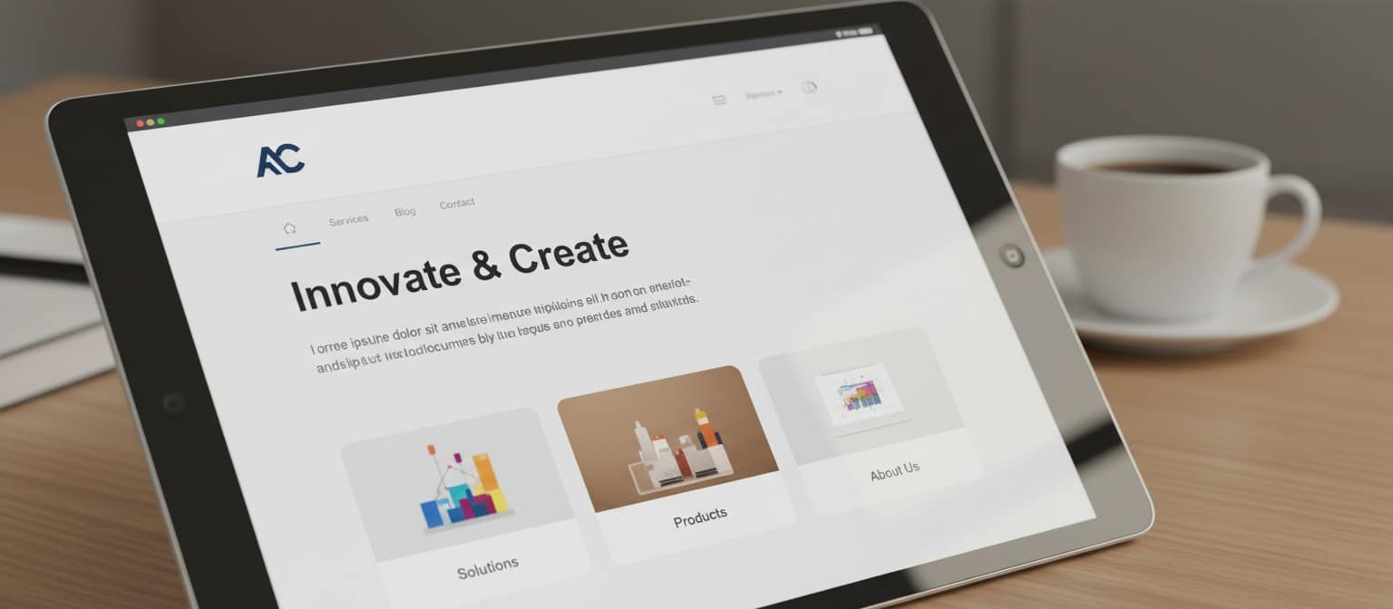
Strategic Design Considerations
Separate Branding From Content Zones
A clean way to integrate logos is to visually separate branding from content. This can be done through spacing, alignment, or subtle dividers. By creating a designated “brand zone,” you prevent the logo from bleeding into the main message.
This approach is especially effective in long-form digital content, where readers are focused on reading rather than scanning for brand signals. Keeping logos contained preserves clarity and reduces cognitive load.
Avoid Using Logos as Fillers
Another common pitfall is using logos to fill empty space. Empty space is not a problem—it’s often a sign of good design. Adding a logo simply because a layout feels sparse usually backfires, making the design feel forced or unbalanced.
If a section feels empty, consider adjusting spacing, typography, or layout flow instead. Logos should appear because they serve a purpose, not because something feels missing.
Adapt Logo Use for Responsive Design
Digital content lives on screens of all sizes. A logo that looks reasonable on a desktop layout may feel intrusive on mobile. Smart branding anticipates this by scaling logos down or repositioning them entirely for smaller viewports.
Clean branding systems treat logos as flexible elements. Their size and placement respond to context, ensuring they remain legible without overwhelming the screen.

Minimal Logo Use Builds Stronger Trust
Ironically, restraint often strengthens brand perception. When logos are used sparingly and thoughtfully, they signal confidence. They suggest that the brand doesn’t need to shout to be recognized.
In digital content, where attention is limited and clutter is common, clean logo usage stands out precisely because it doesn’t demand attention. It earns it.
Ultimately, branding without mess comes down to intention and consistent execution. Logos should clarify, not crowd — a lesson that applies equally to physical products, where branded tote bags succeed when the design stays restrained. When treated as references, anchors, and signals of credibility rather than decorative elements, they enhance digital content instead of overwhelming it.


