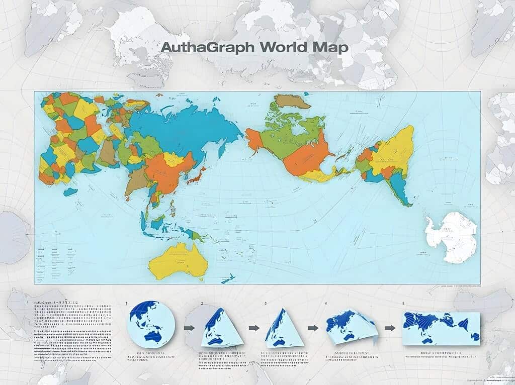
There are lots of errors in our current maps, including distorted land and sea sizes and geographical misunderstandings. In 1999, Japanese architect Hajime Narukawa tackled the century-old challenge of how to accurately draw an oblate spheroid Earth on a flat plane — and in doing so, created what many now consider the most accurate map of the world: the AuthaGraph World Map.
Why Most World Maps Are Wrong
The Problem With the Mercator Projection
The world map most of us grew up with — the Mercator projection — was created by Gerardus Mercator in 1569 for nautical navigation. While it excelled at helping sailors plot straight-line courses, it came with a massive trade-off: it grossly distorts the size of land masses the further you move from the equator.
The consequences are staggering:
- Greenland appears 550% larger than it actually is. In reality, Greenland could fit inside Africa 14 times.
- Africa looks roughly the same size as Greenland on a Mercator map, but Africa is actually larger than all of North America combined.
- Canada and Russia appear enormous, dominating the northern hemisphere. Canada is only about 2.3 million km2 larger than Australia — not the giant the Mercator suggests.
- Antarctica stretches across the entire bottom of the map, when its true land area is about the same as Australia.
- Alaska looks bigger than Mexico, but Mexico is actually larger.
- Scandinavia dwarfs India on the Mercator, yet India is roughly three times its size.
These aren’t minor inaccuracies — they shape how billions of people understand global geography, geopolitics, and the relative importance of nations.
Why Every Flat Map Distorts Reality
Here’s the fundamental problem: you cannot perfectly flatten a sphere onto a rectangle without stretching, tearing, or compressing something. It’s mathematically impossible. This is known as the map projection problem, and cartographers have been wrestling with it for over 450 years. Today, projects like the Earth Archive are using advanced laser scanning to create the most detailed 3D maps of the planet ever attempted.
A French mathematician named Nicolas Auguste Tissot developed a way to measure this distortion, called Tissot’s indicatrix. Imagine placing identical circles at regular intervals across the globe. When projected onto a flat map, those circles deform — they stretch, squish, and change shape. The more a circle deforms at a given point, the more the map distorts reality there. On a Mercator map, the circles near the poles balloon into massive ellipses, while those near the equator stay nearly round.
Every flat map must choose what to sacrifice: area accuracy (equal-area projections), shape accuracy (conformal projections), direction accuracy, or some compromise between all three. There is no perfect solution — only trade-offs.
Other Map Projections That Tried to Fix the Problem
Before the AuthaGraph arrived, several cartographers attempted to correct the Mercator’s distortions — each with their own strengths and weaknesses:
Gall-Peters Projection (1855 / 1973)
This equal-area projection fixes the size problem: countries are shown in their correct relative proportions. Africa finally looks as large as it truly is, and Greenland shrinks back to reality. The trade-off? Shapes are stretched vertically near the equator and compressed near the poles, making continents look unnaturally elongated. First described by James Gall in 1855, it gained fame in 1973 when Arno Peters promoted it as a fairer map that restored “rightful proportions” to developing nations in the Global South.
Robinson Projection (1963)
Arthur Robinson called his creation a “compromise” — it doesn’t perfectly preserve area or shape, but it looks pleasingly spherical. His approach was unconventional: he worked visually first, tweaking variables by eye until the map “looked right,” then reverse-engineered the mathematics afterward. The National Geographic Society adopted it for world maps from 1988 to 1998, and it remains popular in classrooms today.
Winkel Tripel Projection (1921)
Oswald Winkel designed this projection to minimize three types of distortion simultaneously — area, direction, and distance (hence “Tripel,” German for triple). It’s neither fully equal-area nor conformal, but it strikes an elegant balance. Since 1998, the National Geographic Society has used the Winkel Tripel as its standard world map projection.
Dymaxion Map (1954)
Buckminster Fuller — the inventor of the geodesic dome — projected the Earth onto an icosahedron (a 20-sided polyhedron) that unfolds flat. His goal was to present the continents as “one island” with no fixed “right way up,” challenging the north-is-up convention. The Dymaxion Map would later directly inspire Hajime Narukawa’s AuthaGraph design.
Equal Earth Projection (2018)
The newest contender, developed by cartographers Tom Patterson, Bojan Šavrič, and Bernhard Jenny, is an equal-area pseudocylindrical projection inspired by the Robinson. It shows continents and oceans at their true relative sizes while maintaining a visually natural appearance. Published in the International Journal of Geographical Information Science, it’s gaining traction in schools and was endorsed by the African Union in 2024 as a more equitable representation of the continent.
How the AuthaGraph Became the World’s Most Accurate Map
Hajime Narukawa’s Six-Year Quest
Hajime Narukawa, a Japanese architect and artist based at Keio University’s Graduate School of Media and Governance, spent six years developing the AuthaGraph projection. His work began in 1999, driven by a conviction that the maps we use every day fail to represent the planet honestly — particularly the polar regions, which are critical to understanding climate change and territorial claims in the 21st century.
In 2016, his efforts paid off spectacularly: the AuthaGraph World Map won the Grand Award of Japan’s Good Design Award, beating over 1,000 entries across all categories. The award jury praised it for faithfully representing “all oceans [and] continents, including the neglected Antarctica,” calling it “an advanced precise perspective of our planet.”
The GOOD DESIGN award ceremony is hosted by the Japan Institute for Design Promotion and was founded by the Japanese Ministry of International Trade and Industry in 1957.


The 96-Triangle Tetrahedron Method
So how does it actually work? Narukawa’s ingenious approach divides the spherical surface of the Earth into 96 triangles. These triangles are then projected onto the surface of a tetrahedron (a four-sided pyramid). That tetrahedron is “inflated” back toward a sphere shape, then flattened, cut, and unfolded into a rectangle.
The multi-step process — sphere to 96 regions to inflated tetrahedron to flat tetrahedron to rectangle — preserves the true relative sizes of both land masses and oceans. This is what sets the AuthaGraph apart: most equal-area maps preserve land proportions at the expense of the oceans or vice versa. The AuthaGraph achieves both simultaneously.
Another remarkable feature: the map can be tessellated — tiled endlessly in any direction without seams or breaks, creating a continuous representation of the globe. You can even fold the flat map back into a three-dimensional sphere or tetrahedron. The International Space Station’s orbital path has been plotted across a tessellation of Narukawa’s projection, demonstrating its real-world applicability.
The AuthaGraph has since been adopted by the National Museum of Emerging Science and Innovation (Miraikan) in Tokyo as its official world mapping tool. It has also been incorporated into Japanese textbooks, exposing an entire generation of students to a more honest picture of the planet. The map’s ability to accurately depict polar regions makes it especially valuable for tracking climate change — a purpose Narukawa explicitly designed it for.
What Makes the AuthaGraph Different
The world map we accept today, known as the Mercator map, made in 1569 by geographer Gerardus Mercator, largely misreports the sizes of Greenland, Africa, and Antarctica. However, the AuthaGraph World Map takes into consideration their actual sizes, the ozone hole above Antarctica, our changing world due to global warming, the continental drift, and how the poles are melting away.


Watch this excellent explanation of the AuthaGraph projection and why it matters:
How AuthaGraph Compares to Other Accurate Projections
No single map projection is perfect for everything. Here’s how the major contenders stack up:
- AuthaGraph (2016): Best overall accuracy for both land and ocean proportions. Tessellatable. Antarctica faithfully represented. Not yet officially classified as equal-area by cartographic standards — but very close.
- Equal Earth (2018): Equal-area with natural-looking shapes. Endorsed by the African Union. Gaining adoption in schools. Less effective at showing polar regions compared to AuthaGraph.
- Winkel Tripel (1921): Elegant compromise minimizing three types of distortion. National Geographic’s standard since 1998. Slight size distortion at poles.
- Gall-Peters (1855/1973): True country sizes but visually jarring — continents look stretched. Politically significant for challenging Eurocentric map conventions.
- Robinson (1963): Visually pleasing compromise. Former National Geographic standard. Neither truly equal-area nor conformal.
Where to Get an AuthaGraph Map
If you’d like to own this remarkable map, several versions are available. The globe version (around $60) can be dismantled, given as a gift, or hung on your wall and you can find it here. Wall posters and foldable origami versions — which transform from a flat sheet back into a sphere — are also widely available. The AuthaGraph’s tessellation property even makes it possible to create large multi-panel displays where the map repeats seamlessly across walls.
Also, if you’re fascinated by maps and how our planet has changed, you might enjoy this free online tool where you can plug in your location and see how it’s changed over the last 750 million years. And if you’re captivated by the artistry of cartography, don’t miss our story about a map artist who turned quarantine into a creative masterpiece.