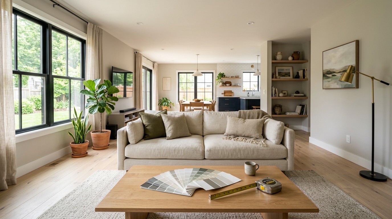
A paint color can look convincing on a small card and completely different once it covers an entire wall. Natural light shifts through the day, flooring reflects color upward, nearby furniture adds contrast, and warm bulbs can make a neutral shade appear yellow or muddy. That is why choosing paint from a store display or a single inspiration photo often leads to unnecessary repainting. The useful question is not simply which color looks attractive, but how that color behaves inside the room you already have.
Physical samples remain important, yet they are slow when you are still comparing broad directions such as warm beige, muted green, dusty blue, or off-white. A visual preview can narrow those possibilities before you buy several test pots or move furniture around. If you want to explore the change directly on a photo of your own space, Nano Banana Pro can be one option for testing a controlled recolor while keeping the room recognizable. The preview should be treated as a decision aid, not a promise of exact paint appearance. The method below shows how to make those previews useful and how to verify them before committing.
Start With a Reliable Room Photo
A weak source photo creates a weak comparison. If the image is heavily filtered, shot at night, or dominated by window glare, you are no longer judging the room under conditions that resemble everyday use. Start with a straight, wide view that includes the wall you want to change plus enough flooring, furniture, trim, and neighboring surfaces to show the room’s real color relationships.
1. Photograph the Room in Neutral Light
Take the main photo during a period when the room is evenly lit rather than flooded by direct sun. Turn off decorative filters and avoid extreme wide-angle distortion. If the room changes dramatically between morning and evening, take a second photo later in the day. Two honest photos are more useful than one polished image because they reveal how the same wall sits beside different light temperatures.
2. Isolate One Surface at a Time
Decide exactly what is allowed to change before creating any preview. For example, change the main wall but keep the ceiling, trim, floor, sofa, artwork, windows, and lighting unchanged. This matters because a full-room makeover may look impressive while hiding whether the wall color itself works. A controlled comparison gives you one variable to judge and makes differences between options easier to interpret.
3. Test Several Nearby Color Families
Do not jump immediately from white to charcoal to bright terracotta. Start with a small family of plausible choices, such as warm ivory, light greige, soft mushroom, and muted taupe. Closely related options reveal undertone differences that are easy to miss on a paint chip. Once one family clearly suits the room, you can explore lighter, darker, warmer, or cooler versions without restarting the whole decision.
4. Compare Results at Full Size
Review each version at a large enough size to see the edges around windows, shelves, artwork, and furniture. A useful preview should preserve those boundaries and change the intended surface consistently. If color spills onto trim, changes the sofa, alters shadows, or moves objects, discard that version rather than judging the palette from it. The point is to compare color, not to admire a redesigned room.
Compare Color Changes Without Changing Everything
The most useful digital test is deliberately boring: the room should remain almost identical while one color changes. That makes the result closer to a controlled experiment. If a tool adds new lamps, replaces furniture, changes the weather outside, or makes the space brighter, you cannot tell whether you prefer the paint or the newly invented surroundings.
When you have a clean room photo and two or three realistic candidates, Nano Banana Pro can be used at this stage as an image-editing route. Upload the room photo and describe the target surface, the desired color direction, and the elements that must remain unchanged. A useful instruction might specify “recolor only the back wall to a muted warm sage; preserve the white trim, wood floor, sofa, artwork, window view, camera angle, and existing lighting.” Generate more than one version, then reject any output that changes geometry, furnishings, or light before comparing the wall color itself.
After that, use the previews to eliminate directions rather than crown a final winner. Perhaps cool gray makes the floor look orange, while a warmer neutral connects better with the wood. Maybe a deep green feels balanced in the evening image but too heavy in daylight. Those observations are valuable because they tell you which physical samples deserve a place on the wall.

Judge the Preview Against Real Conditions
A screen cannot reproduce paint perfectly. Monitor brightness, phone display settings, camera white balance, wall texture, sheen, and reflected daylight all affect what you see. A digital preview can answer “Does this color direction belong in the room?” much better than “Will this exact paint code look exactly like this image?” Keeping that distinction prevents false confidence.
Once you have narrowed the field, obtain physical samples of the closest real paint colors. Apply them on large movable boards or test areas rather than tiny squares. View them beside the trim and flooring, then check them in morning light, afternoon light, and with the lamps you normally use after dark. A color that survives all three conditions is a stronger candidate than one that looks spectacular for a single hour.
Pay attention to relationships, not just the wall in isolation. A warm off-white may make a cool white ceiling look blue. A gray-green may work with a tan sofa but clash with a red-toned floor. A dark color can make artwork look sharper while reducing the apparent brightness of a narrow room. These are the interactions a preview should help you notice early, before you invest in gallons of paint.
Also check how the room is actually used. A color that feels calm in a reading corner may look dull in a kitchen where task lighting dominates. A dramatic tone that photographs well may feel tiring across a large wall you face for eight hours while working. The best choice supports the room’s daily function as well as its style.
Turn Visual Experiments Into Better Decisions
The value of a paint preview comes from comparison discipline. Start with an honest photo, change only one surface, test a small family of colors, and reject any version that alters the room around the wall. Then use the digital results to narrow your choices, not to replace real samples. This sequence reduces noise: first you decide which color direction belongs in the space, then you confirm the exact shade under the room’s real lighting and materials.
Over time, the same method becomes useful beyond one repaint. You can apply it when comparing cabinet colors, a feature wall, curtains, large furniture, or other changes that interact with existing finishes. The important habit is to separate exploration from verification. Visual experiments are fast and flexible, while physical checks reveal what the room will actually do. When both stages point in the same direction, you can commit with far more confidence and with fewer expensive changes after the work is finished.